Tag Archives: engaging audiences

Maps versus Staff on the Museum Floor

When I am physically in the museum space, whether observing or surveying visitors, people always talk to me and ask me questions. I have no doubt from my observations that people like to see museum staff on the floor. It doesn’t matter whether the museum arms people with maps, touch pads, audio tours or text panels – visitors like to talk to real people. They have questions, they want directions and most of all they want to give you feedback about the things that they are seeing and doing in the museum. They want to tell you what they like, they want to tell you what you are doing well, what should be on display and they want to tell you about other museums doing similar things better than you are.

I don’t think that this is a bad thing. Museums need to know their audiences and they cannot possibly know them if they don’t do a little face to face work, rather than just counting numbers in galleries. Exhibitions need not be static places. Even if the exhibit layout is “perfect” from the curator’s viewpoint, there will always be room to tweak the exhibit in some way – whether it’s a text panel/ label, training “front of house” staff and educators/guides about a new exhibition space, doing continuous maintenance or just ensuring that museum visitors are making the most of any exhibition or permanent gallery on any given day.

I have seen many front of house staff appear exasperated that visitors can’t find their way around an art gallery or museum – even with a map. The fact is that maps are prepared by people who are familiar with the workings of a particular space and so a map already makes sense to them. In reality, people move through museums and art galleries  intuitively and so it’s better to build on that natural movement or provide them with really clear directions via gateway text panels and objects or pathways within the space.

img_6957

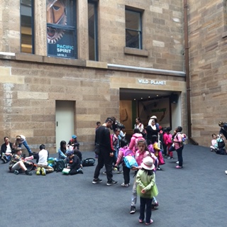
New entry to the Australian Museum

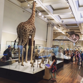
For example, at the Australian Museum, there is a gentle slope leading from the Museum’s new point of entry into the Wild Planet gallery. Sadly, most people intuitively turn right into the Skeleton Hall and then climb the stairs (even with strollers!) into Wild Planet which totally defeats the purpose of having a new entrance. When visitors move through the Skeleton Hall, they miss the Help Desk and the Museum shop and often become disoriented about using the lifts, ramps and stairs to the upper galleries. There is a museum map but people just follow their noses. If welcome staff were placed at the entrance to the Skeleton Hall armed with maps and information, they could offer visitors the alternative pathways – pointing out the lifts and the easy access ramp to Wild Planet.

mg_5_majolica

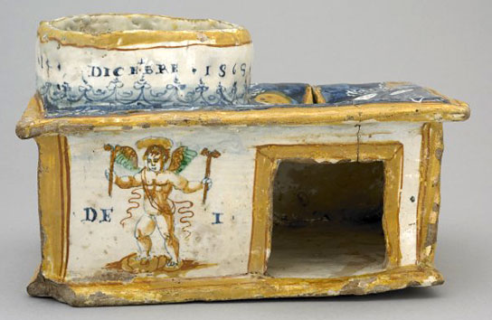
The British Museum uses “gateway objects” as an effective way to lead audiences on a trail through their galleries engaging them with bigger stories and themes.

I mentioned in a previous Blogpost (Musing on Text and Labels) that the British Museum uses “Gateway Objects” in museum galleries to catch the eye of the viewer and to give the visitor some understanding of the space and themes of the gallery without them having to read every single label in the exhibition. Through the clever use of design, someone entering the gallery will immediately be able to follow a trail of key objects through the gallery without needing a map or having to read everything to comprehend the purpose of the space. The same technique could be used for the whole museum and not just for a specific exhibition or permanent gallery. It isn’t as important for members or frequent visitors but for the unfamiliar visitor or one-off tourists, it could be the key for them to sample what’s on offer at the museum without having to struggle with maps or having to read every text panel which usually results in “museum fatigue”.

A great article in Hyperallergic spoke about an interactive mapping approach  by students in the School of Visual Arts’ MFA Visual Narrative program. The students developed a number of creative, interactive maps for the Metropolitan Museum of Art  which look way more interesting than the map in the link on the MMA website. Interactive maps are great but I don’t think that I’ve come across a museum yet with perfect access to free wi-fi in every room. It seems to be either intermittent or timed for 10 minutes or have some complicated temporary sign-up method (even worse if you don’t speak the language!).

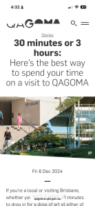
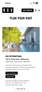
One positive step that I have noted on the home page of most museum and art gallery websites is the “Plan Your Visit” tab which often links to an interactive or downloadable map so that you can think about the visit ahead of time. I still believe that there should be a “Taster Tour” tab where time poor visitors can at least plan for a taste of the museum’s vision and collection. With greater digital support of the collection, they can “engage” further online after their visit and at their leisure if they can’t physically revisit the space. Staff on the floor can really enhance the experience for these visitors by providing directions or insight into what is on display and the importance of some of the objects to the museum collection.

2016-12-11.png

“The Museum is our backyard….” Do you have families visiting your cultural institution weekly?

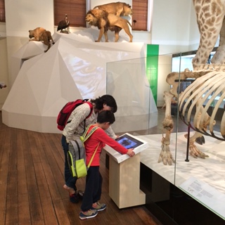
One of the most interesting facts that I have learned from visitor studies at the Australian Museum, Sydney, was that many “inner city dwellers” use the museum as their backyard (metaphorically speaking of course).

I found that a number of families live in apartments in the inner city and have taken out  membership to several cultural institutions and that they regularly bring children to come and play at the Australian Museum. I don’t mean running around kind of play but definitely spending hours at the museum (to escape their apartments) in the Search and Discover section of the museum or participating in craft activities (when available) at Kids Space. This was quite a revelation to me because I’ve never lived in a small flat with children. My four kids were brought up in the suburbs, 20 kilometres away from the city and had access to a backyard, local parks and plenty of local group activities nearby. We would often travel to the city for a museum visit but would not visit regularly.

This is an interesting discovery for any city based cultural institutions. Most museums want to grow their memberships and attract repeat visitors and be known as being family friendly. If city dwellers are visiting often with children, particularly the preschool age group – are museums doing enough to keep those families and children interested? The usual museum approach would be to develop the Summer Blockbuster exhibition and limit most of the child focussed activities to school holidays  but perhaps there are a number of children not at school who could benefit from some permanent free play spaces and child focussed exhibits all year round. Such spaces need not be underutilised and would be attractive to interstate and international visitors as well as school groups on excursions all year round. I have noticed that there are large numbers of European tourists visiting Sydney in the northern hemisphere’s Summer months and it would be interesting to look at the statistics on China and South-East Asia as well as visitors from North America travelling with children.

At any time of year I would recommend that cultural institutions help families to plan their visit by providing a link on their websites. For example the Smithsonian Top 10 Kid’s Tips or ensuring that your museum is mentioned in an article like The 10 best Family Friendly Galleries in London.  Many museums, libraries and galleries do offer programs for families and put a lot of thought into being “family friendly” but they may not have thought about satisfying the frequent visitor or tourist that might not visit during school holidays or on weekends when most of these programs are available?