
When I am physically in the museum space, whether observing or surveying visitors, people always talk to me and ask me questions. I have no doubt from my observations that people like to see museum staff on the floor. It doesn’t matter whether the museum arms people with maps, touch pads, audio tours or text panels – visitors like to talk to real people. They have questions, they want directions and most of all they want to give you feedback about the things that they are seeing and doing in the museum. They want to tell you what they do and don’t like, they want to tell you what you are doing well, what should be on display, and they want to tell you about other museums doing similar things better than you are.
I don’t think that this is a bad thing. Museums need to know their audiences, and they cannot possibly know them if they don’t do a little face to face work, rather than just counting numbers through the front door or in specific galleries. Exhibitions need not be static places. Even if the exhibit layout is “perfect” from the curator’s viewpoint, there will always be room to tweak the exhibit in some way – whether it’s a text panel/ label, training “front of house” staff and educators/guides about a new exhibition space, doing continuous maintenance or just ensuring that museum visitors are making the most of any exhibition or permanent gallery on any given day.
I have seen many “front of house” staff appear exasperated that visitors can’t find their way around an art gallery or museum – even with a map. The fact is that maps are prepared by people who are familiar with the workings of a particular space and so a map already makes sense to them. In reality, people move through museums and art galleries intuitively and so it’s better to build on that natural movement or provide them with really clear directions via gateway text panels and objects or pathways within the space.
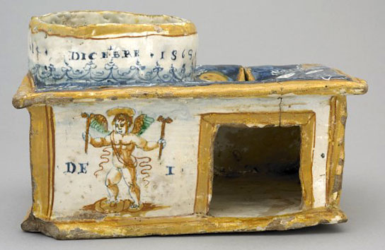
British Museum. Earthenware Candle Box/Holy Water Box. 1565. Siena, Italy.
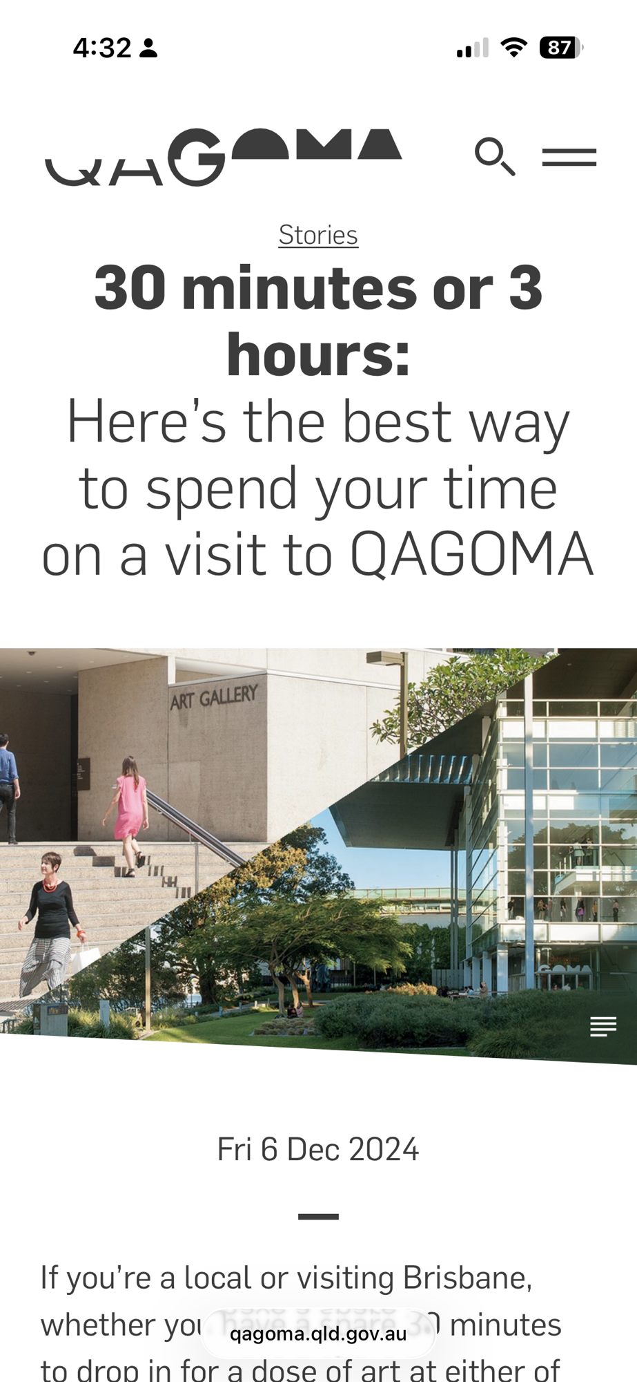
The British Museum offers many “plan your visit” tools on its website. A couple of options use “gateway objects” as an effective way to lead audiences on a 1 hour or 3 hour trail through the museum.
These objects grab the viewer’s attention and give visitors a sense of the gallery’s space and themes without requiring them to read every label. With smart design, anyone entering can instantly follow a path of key pieces through the gallery, no map or exhaustive reading needed, to grasp the purpose of the space.
The same technique could be used for the whole museum and not just for a specific exhibition or permanent gallery. It isn’t as important for members or frequent visitors but for the unfamiliar visitor or one-off tourists, it could be the key for them to sample what’s on offer at the museum without having to struggle with maps or having to read every text panel which often results in “museum fatigue”.
A great article in Hyperallergic spoke about an interactive mapping approach by students in the School of Visual Arts’ MFA Visual Narrative program. The students developed a number of creative, interactive maps for the Metropolitan Museum of Art which look way more interesting than the map in the link on the MMA website. Interactive maps are great, but I don’t think that I’ve come across a museum yet with perfect access to free wi-fi in every room. It seems to be either intermittent or timed for 10 minutes or have some complicated temporary sign-up method (even worse if you don’t speak the language and are navigating with Google translate!).
Since Covid, most museum and art gallery websites have enhanced their “Plan Your Visit” features, and more importantly, digital access to collections has greatly improved. Offering a “Taster Tour” for time-poor visitors is essential to give them at least a glimpse of the museum’s vision and collection. With better digital support, they can continue exploring online after their visit, at their own pace, if they can’t return in person. Floor staff can further enrich the experience by offering directions or insights into the displays and highlighting the significance of certain objects in the collection.
Other Reading
MuseumNext Developing Wayfinding Systems in Museums
Gareth Davey (2024) Understanding Visitor Path Choice and Enhancing
Wayfinding in Museums: A Critical Review of a Century
of Research


